This a personal case study. I am not affiliated in any way with Substack. Figma Board
Summary
Substack is a fast-growing media platform that enables independent creators to publish newsletters, podcasts, and videos. As it expands beyond newsletters, users face increased friction in content curation and engagement. This case study explores how Substack can evolve into a more community-centric, discovery-friendly platform for both readers and writers.
Background
Substack is a media platform for a wide range of content, including writing, video and podcasts. It provides the writer a median to create a more organic audience for their content, packaged within a easy-to-use platform.
A table showing some user persona analysis is shown below.
| Persona | Name | Age | Type | Comments |
|---|---|---|---|---|
| 1 | Maya | 31 | Reader | Overwhelmed w/ mixed media (articles, notes, podcasts) → wants better content organization. |
| 2 | Zahid | 21 | Writer | Struggles to understand which content drives user engagement. |
Problem Statement
As Substack expands its media offerings and social features, readers struggle to curate their experience, while writers lack visibility into their audiences and community relationships.
Research & Discovery
Forum Screenshots
- Creators struggle in understanding what works and what doesn’t work even in spite of the presence of an analytics dashboard.
- Readers feel like their feed is unfiltered and the addition of notes and podcasts has made the curation of content more messy.
- Creators seek a way to cultivate a relationship with other writers their audience is interested in.
- All users seek a way to engage in a more community like way on the service.
Translating these insights into results, is the table below.
| Insight | Result |
|---|---|
| Creators don’t know what engagement works | Needs deeper analytics and visual feedback |
| Readers’ feeds feel messy with new formats | Needs content segmentation |
| Creators want community with similar writers | Build social graph to surface shared audiences |
Solution Breakdown
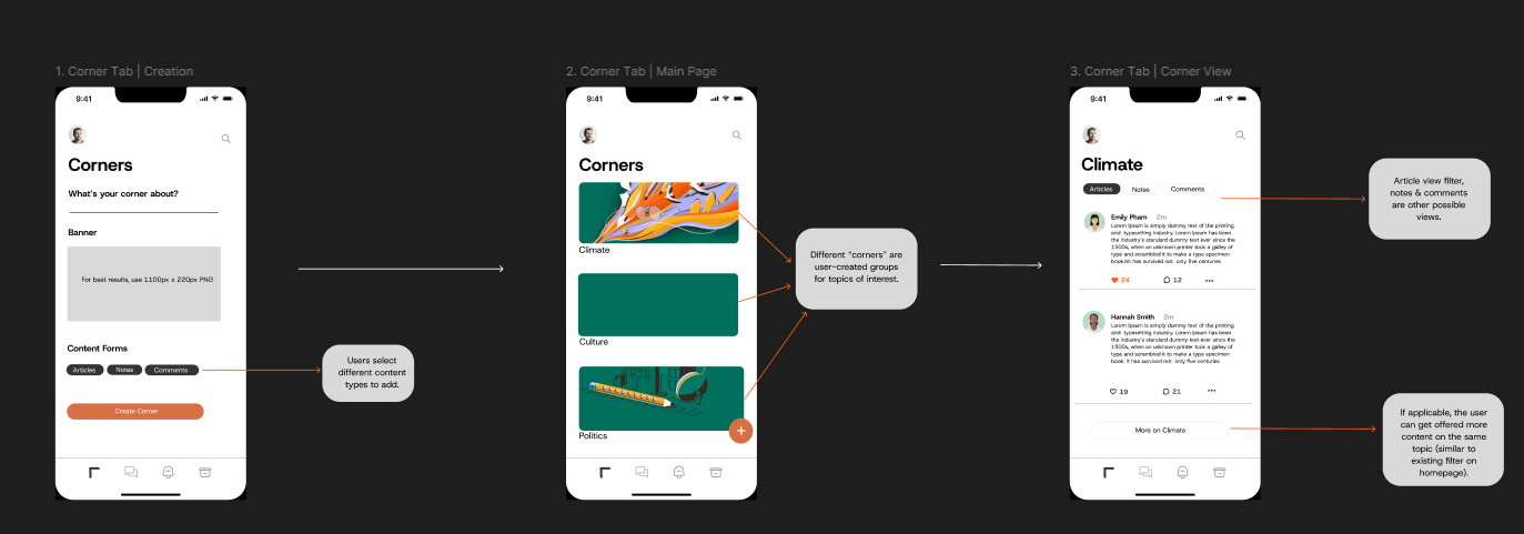
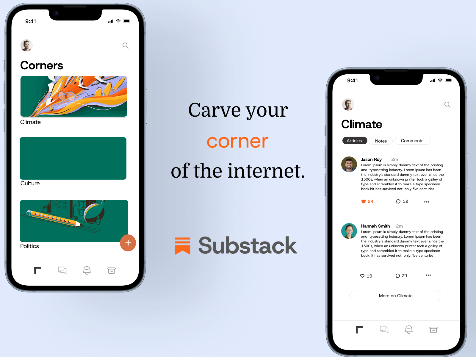
- Corners (Spaces) → for Readers
A way for users to curate content by theme or topic, e.g., Climate, Culture, Politics. Inspired by tags, this lets readers organize content across formats (articles, notes, podcasts).
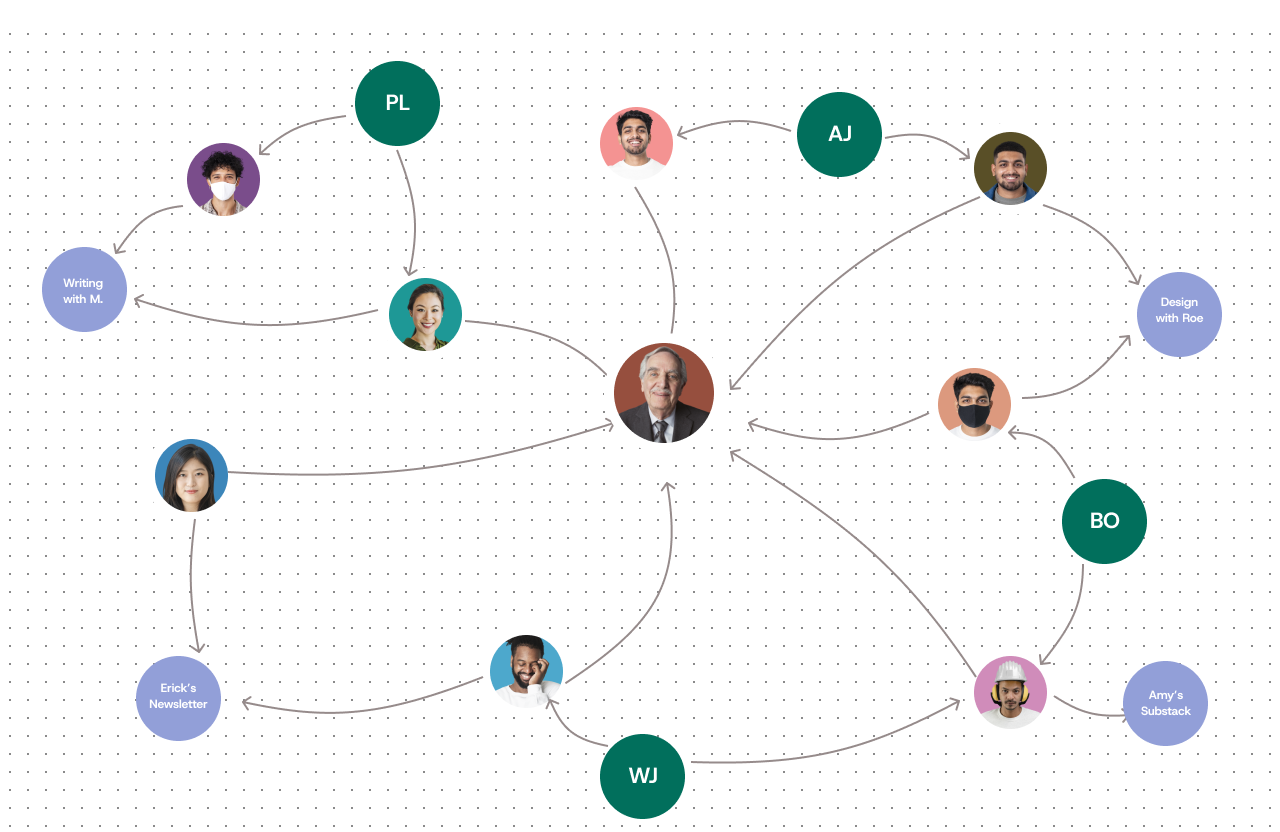
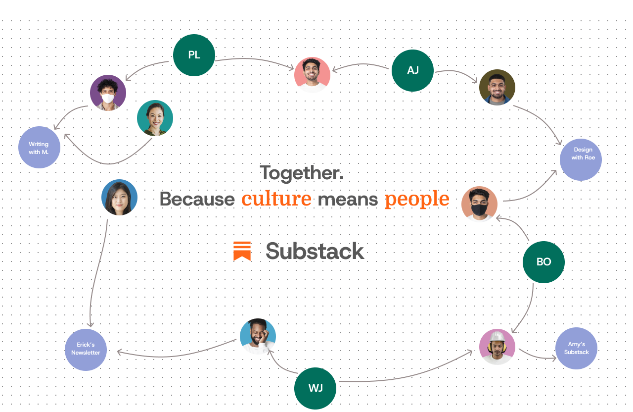
- Graph View → for Creators
A visual map of mutual subscribers and creator relationships, helping writers understand their audiences’ shared interest.
We translate user pain points into solutions in the below table.
| Pain Point | Solution |
|---|---|
| Creators may struggle to to understand what methods of engagement best work for their audience. | Engagement dashboard + Graph View |
| Readers may struggle to organize the content they see, notably across different forms. | Spaces (tabbed content areas) |
| Creators may seek a way to understand their audiences interest outside their platform. | Graph View - mutual subscriber visualization |
| Readers and creators alike seek a way to be part of a community of like minded people. | ”See who else follows” badges |
We also draft some feature analysis using the MoSCoW technique for prioritization.
| Feature | User | Description | MoSCoW | Success Metric |
|---|---|---|---|---|
| Spaces (Corners) | Reader | Tabbed content areas to sort topics | Must-Have | Avg. 2+ spaces/user, ↑ content read time |
| Graph View | Creator | Visual graph of audience overlaps | Should-Have | 60% of creators explore at least 1 node |
| Community Badges | Both | ”See who else follows” tags | Could-Have | 10% CTR on badges in 3 weeks |
The below table shows a validation method for the above features.
| Feature | Validation Method | MVP Version |
|---|---|---|
| Spaces (Corners) | A/B Testing: Test tabbed content areas with two groups (with and without Spaces). Measure engagement (e.g., read time, interaction). Interviews: Gather qualitative feedback from users on curation ease. Metrics: Track spaces created per user, engagement rate. | Tabs in the Library screen for topic-based sorting (e.g., Climate, Politics). |
| Graph View | Usability Testing: Observe creators using the Graph View to explore audience relationships. Click Tracking: Measure interaction with nodes and visual map. Surveys: Collect creator feedback on feature usefulness. | Static graph showing mutual audience overlaps. |
| Community Badges | CTR Tracking: Measure the click-through rate on “See who else follows” badges in posts/comments. User Surveys: Collect feedback on badge usefulness. | Badges in posts and comments showing mutual followers. |
| Engagement Dashboard | Usage Logs: Track dashboard usage frequency and popular sections. Creator Survey: Measure feature value in refining engagement. A/B Testing: Compare engagement metrics with and without the dashboard. | A simplified version with format-specific filters. |
User Flow Visualization
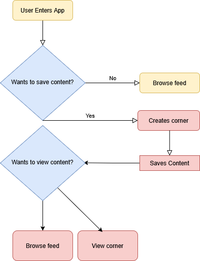
We show below the visualization of user flow for a reader in Substack. Importantly, we introduce through the tabbed content area, a new way for users to to view content, allowing them to stay engaged through two medians versus one.
Corners Design
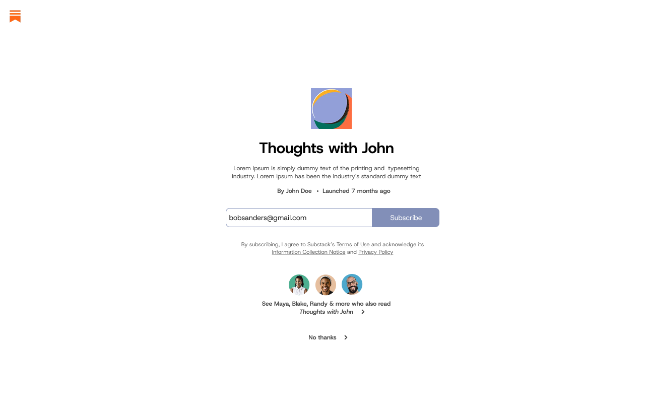
Welcome Page Design
Graph View
Medium Fidelity
Marketing Mockups
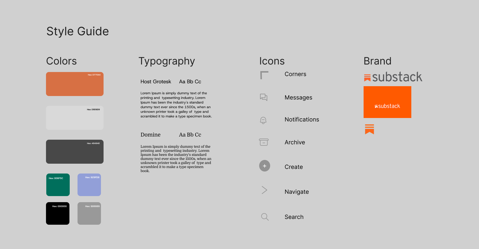
Style Guide
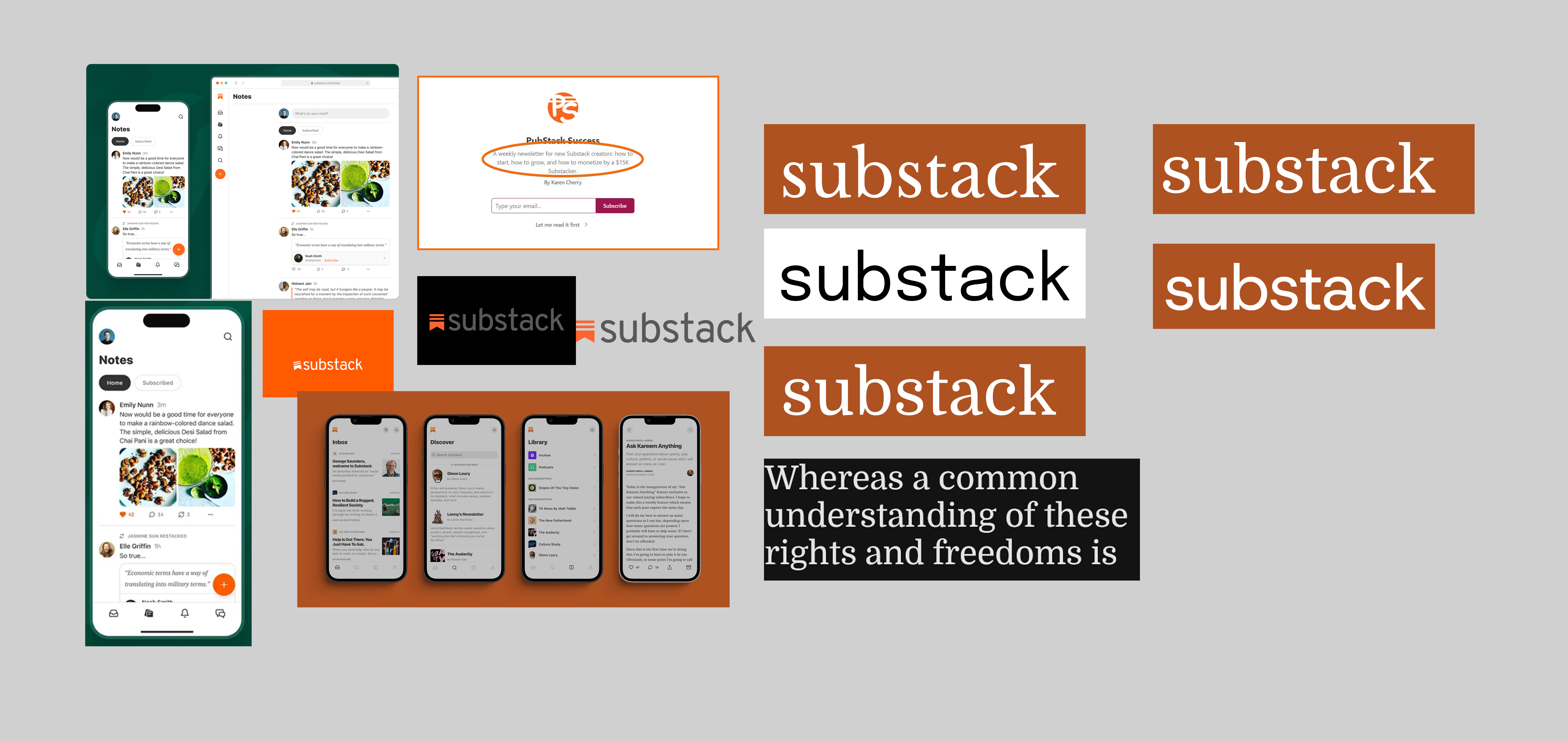
Inspiration Board